May 8, 2020
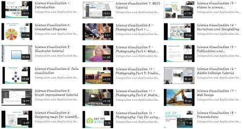
This semester I enrolled in MEES 708T Science Visualization led by Dr. Bill Dennison and UMCES’s Integration and Application Network (IAN) staff. The weekly course used a “flipped classroom” concept in which students watched and read lecture material ahead of class time. This approach allowed for meaningful discussions and opportunities to provide feedback on student work. Lectures and tutorials from this course (27 in total) can be found on IAN’s Science Visualization Youtube channel.
The first half of the course focused on creating specific data visualizations such as graphs, conceptual diagrams, photographs, and maps. Students typically submitted a before visualization piece and solicited feedback and advice from instructors in order change and improve their work. For the second week of a unit, students uploaded an after product using the new tools and concepts learned from the previous week. Towards the end of the course, students began to assemble their data visualizations into posters, reports, and websites. Each week, a different student would also write a blog summarizing the discussions and key points of each class. A list of all blogs from this course can be found here.
We started the course learning how to effectively craft our message by using active titles. A short, concise active title on a poster, report, or image caption can provide an audience with a better understanding of your data. We also learned how to formulate “…and…but…therefore (ABT) statements,” a concept that marine biologist-turned filmmaker Randy Olson advocates. (I included these two communication principles in my Ocean Sciences poster- see below.)
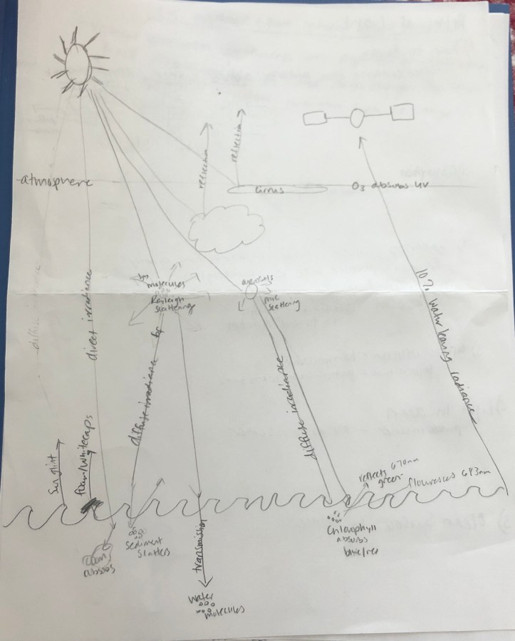
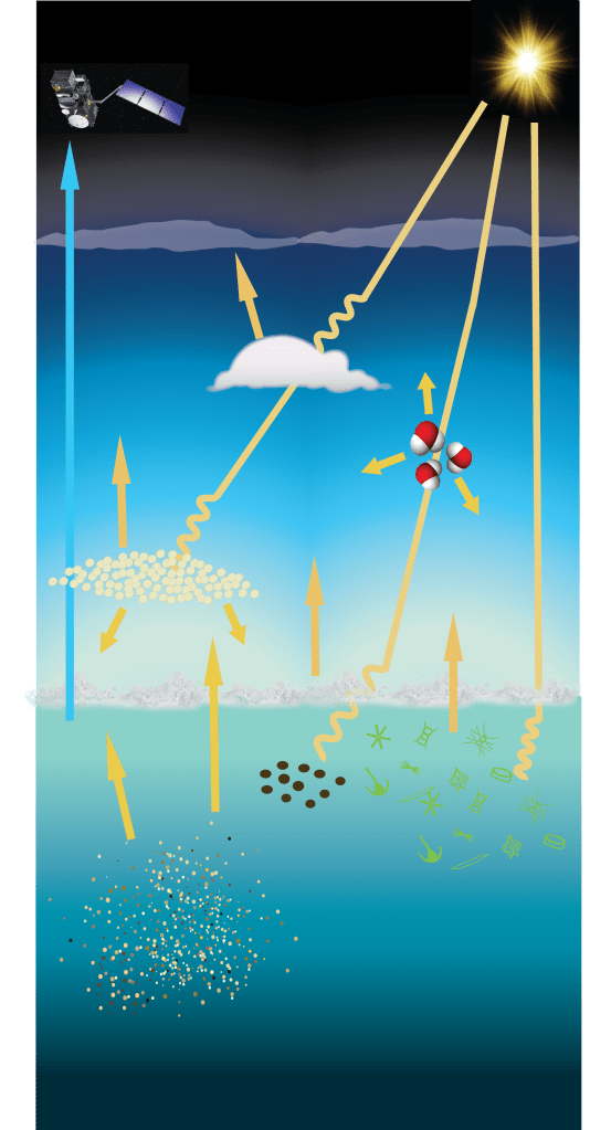
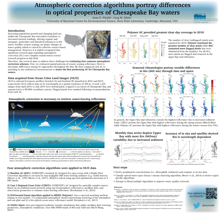
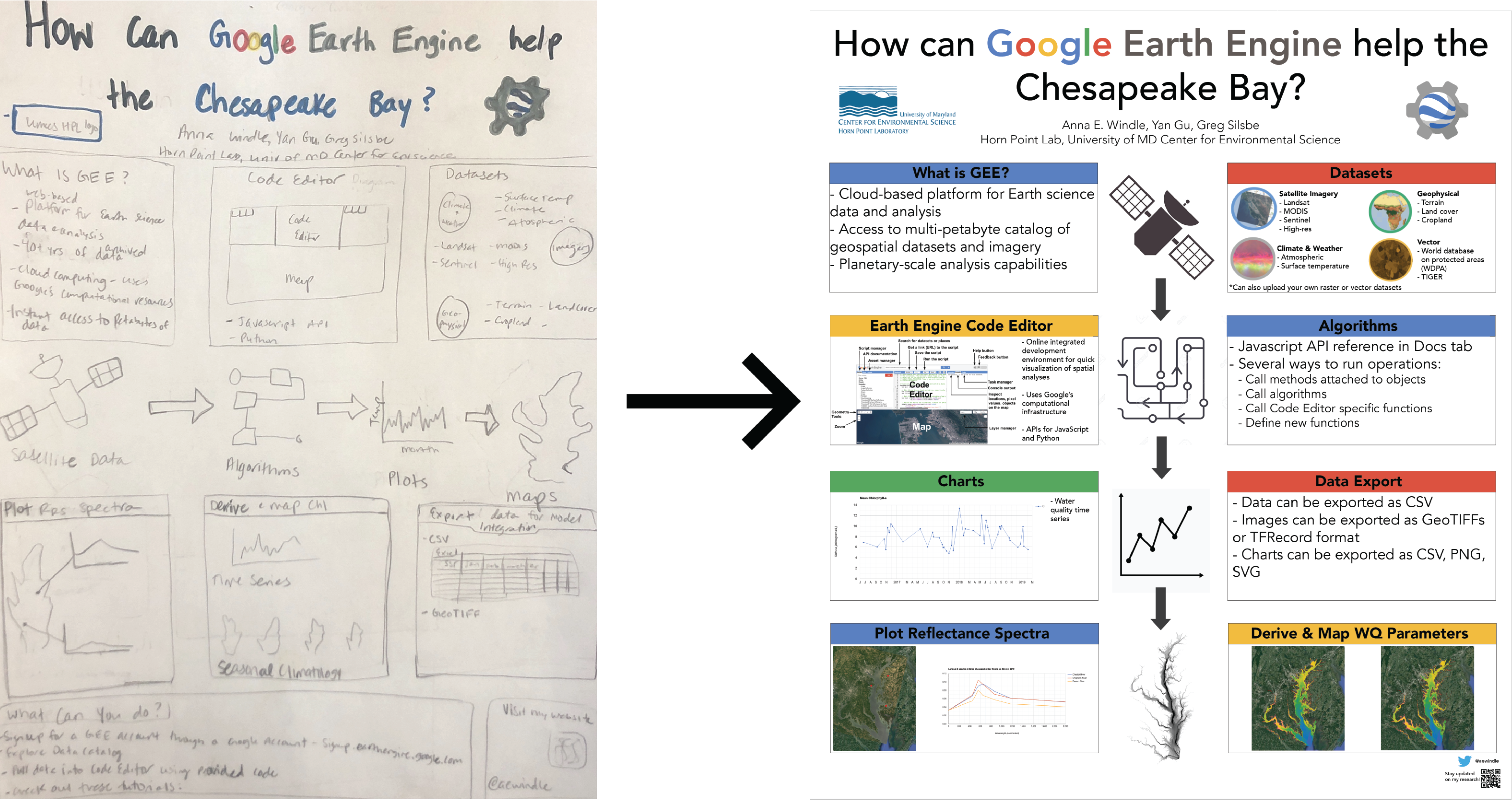
We then focused our attention to conceptual diagrams. IAN Senior Science Communicator Brianne Walsh provided an overview on how to convert hand drawn sketches to computer graphics using science communication products from the IAN symbol and image libraries. To enhance future presentations, I decided to create a conceptual diagram relating to my PhD research: the various paths a photon of light can follow before getting collected by a satellite sensor. Scroll through the slideshow below to view my initial hand-drawn sketch with labelled arrows indicating various interactions of light in the atmosphere and water. My next step was creating a digital sketch using tools in Adobe Illustrator and symbols found on Google and the IAN symbol library. After getting some feedback from Brianne, I made the diagram wider and included a caption that indicates the symbols used. This final diagram was used in a poster presented at the 2020 Ocean Sciences Meeting in San Diego, CA.

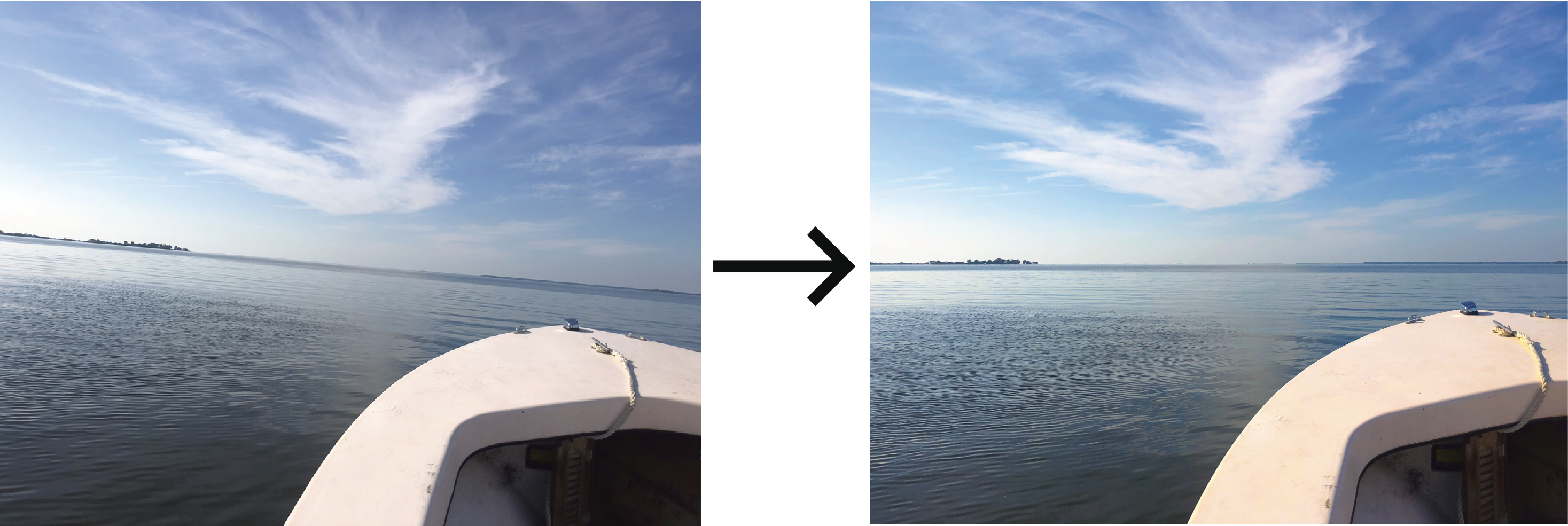
The next unit focused on data visualizations – a graphic used to communicate information clearly and efficiently via statistical graphs, plots, information graphics, tables, charts, etc. IAN Science Communicator Emily Nastase provided an overview on good principles of data visualization and explained how to export figures made on statistical or analysis software to Adobe Illustrator in order to manipulate and improve appearance. I improved a figure originally made in RStudio by increasing font sizes on plot labels and legends, making fonts consistent between titles and labels, rotating axis numbers, and using an active title.

The next unit focused on maps and geographic information systems (GIS). Teaching Assistant Dylan Taille and Senior Faculty Research Assistant Steven Guinn gave an overview of map and spatial analysis design and described how to effectively integrate data into maps. If students had access to an ESRI license, they were able to use ArcGIS, otherwise students utilized the free and open source GIS platform, QGIS. Using ArcGIS Pro, I created a series of maps to compare remote sensing reflectance at 665nm (red wavelength) to interpolated total suspended sediment (TSS) data downloaded from the Chesapeake Bay Program Water Quality Database. TSS data were interpolated following a helpful ArcGIS Pro tutorial I found online. After receiving feedback from instructors, I changed my map colors since a red to green color scheme is not ideal for people who are colorblind. I also switched to two larger legends, centered labels, and one map title.

During week 9, we started a photography unit led by Director of Web Development for Chesapeake Bay Program and UMCES Senior Faculty Research Assistant, Guy Stephens. We learned about the importance of high quality photographs and how to obtain online photos with Creative Commons copyright attribution. We also learned best practices to take them ourselves. After learning about technical factors, composition techniques, and how to take a photo with intent, we edited original and new photos using Adobe Photoshop Lightroom.
Below are some photographs that I’ve taken and edited using new techniques learned from this course such as rule of thirds, filling the frame, leading lines, patterns, and more.
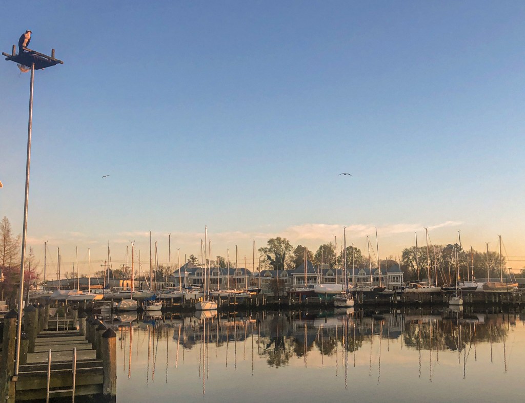
An osprey standing on a nest platform in Deep Harbour neighborhood, Cambridge, Maryland 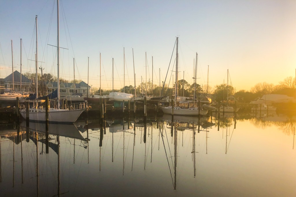
Sailboat reflections on Cambridge Creek 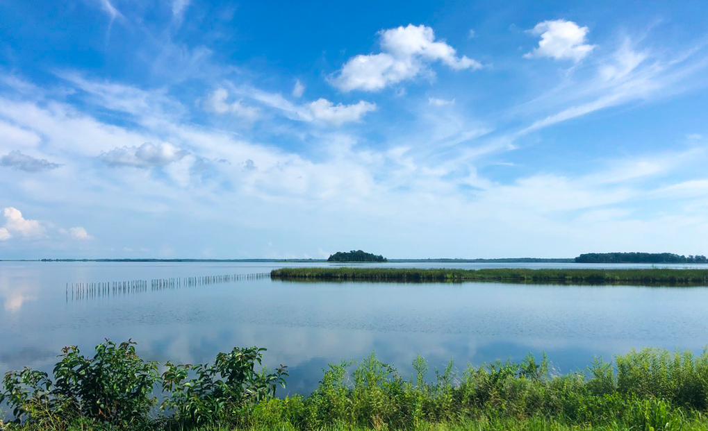
Still water at Blackwater National Wildlife Refuge, Maryland 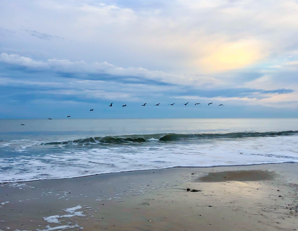
Pelicans flying along the shore in Topsail Island, North Carolina
Next, we learned how to storyboard by IAN Science Communicator Nathan Miller. A mock-up of the content and layout of a publication such as a poster, report, book, etc. is an excellent way to formulate ideas on how to best communicate your message. I chose to design a mock-up poster for an upcoming symposium. Using a pencil, some markers, and paper I sketched out the main elements of my poster. Then, I used Adobe InDesign to create a digital mockup. Although I am still using some placeholder text and figures, I am able to visualize the overall appearance and design of my poster.
For our last assignment, we were tasked to create a website to communicate our science. Fortunately, I had already done this at the beginning of my PhD program using a WordPress.com platform. I pay $4 a month for a “Personal” plan which allows me to use a custom domain name (annaewindle.com) and removes WordPress.com advertising. Other easy-to-use platforms include Wix or Squarespace.
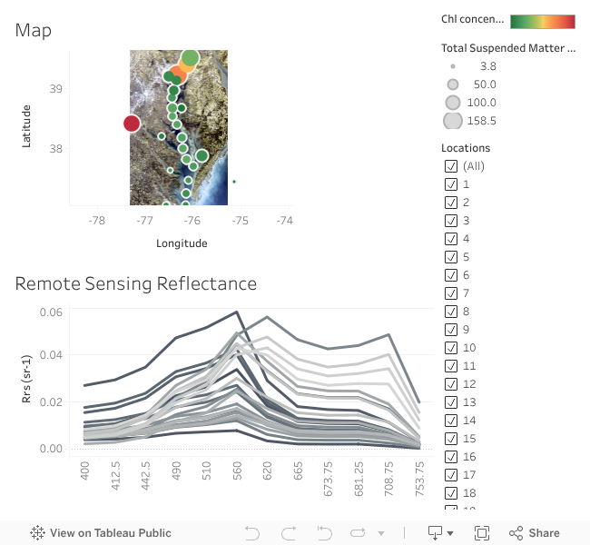
The other part of the last assignment was to create an interactive data visualization to embed into our websites. This last assignment was the most challenging for me; I had trouble deciding on what type of visualization I wanted and what data to use. I started to explore Leaflet, a JavaScript library for interactive maps. After spending a few hours playing around with Leaflet, I decided I wanted to integrate and display more quantitative data. I then started to use Infogram, an easy-to-use visualization tool to design appealing graphics. I had an easier time navigating this tool and will probably use it in the future. I ended up using Tableau Public, a free data visualization software. There was a steep learning curve with this software, but it provided the most user interactivity and individuality that I wanted in order to portray my data. Other data visualization tools include Chart.js, FusionCharts, D3JS, and Google Charts. Press the image below to interact with my Tableau data visualization.
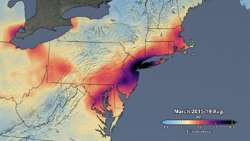
Randy Olson wrote a book titled, Don’t Be Such a Scientist, in which he describes the struggle some scientists have connecting to everyday people. Olson argues that if you are unable to convey scientific knowledge to others in a correct and compelling form, you might as well not have bothered to gather the information at all. I believe communicating science with the general public is just as important as publishing in a scientific journal, and one of the most effective ways to do this involves using visualizations. Science typically receives more attention when an interesting visualization or headline is used. A timely example is NASA’s research on decreasing air pollution during the COVID-19 pandemic. A gif of NO2 concentrations in March 2020 over the Northeast United States compared to average March values clearly and effectively communicates a message: There have been significant reductions in air pollution as people reduced travel during the coronavirus pandemic. The below gif visualization has circulated through various social media outlets and has undoubtedly reached hundreds of thousands of viewers.
I found this science visualization course to significantly broaden my horizon in terms of conceptualizing, visualizing, and communicating my science. The design principles and skills taught by the suite of knowledgeable instructors were extremely valuable. I will use the different tools and software throughout my science career to effectively and clearly communicate my science and advocate for a healthier environment.

Hello Anna,
I really enjoyed your post! It seems like you’re doing very compelling stuff at UMCES. Keep it up like this.
I totally agree with the importance of science communication and data visualization. Kudos to you!!!
Looking forward to see more exciting posts from you.
LikeLike
[…] powerful way to communicate your research is through visualizations (see my last blog post!) GEE has some really amazing animation functionality to display data of interest or a […]
LikeLike